
Why Your AI Render Gets Blurry After a Few Edits (and How to Fix It)
The first AI render looks great, then a few edits in it goes soft and warped. That's generation loss. Here's how to recover, with a real dining room walkthrough.

This post contains affiliate links. If you buy through them, we may earn a small commission at no extra cost to you. We only feature products we'd specify ourselves.

If you design interiors and use AI to render your concepts, you have probably hit this: the first image looks great, but three or four edits in, the whole thing goes soft. The wallpaper turns to mush, the chair seams smear, the chandelier melts into the ceiling. That degradation has a name, generation loss, and it is fixable. You recover from it two ways: upscaling rescues a degraded image partway, and reprompting (starting a fresh generation using what you learned) works far better. For final polish, reprompt first, then upscale.
A quick note on who this is for. Homeowners and DIYers using AI to redecorate are usually happy with a pretty result. Interior designers are not redecorating, they are communicating a specific vision: real products, exact placements, a layout they already have in their head. That is what makes the iteration loop so painful, and why getting out of it cleanly actually matters.
What is generation loss?
Generation loss is the cumulative loss of quality that happens when you repeatedly edit and re-generate the same AI image, using each new output as the input for the next round.
The classic analogy is a photocopy of a photocopy of a photocopy. Every copy is a little worse than the one before, and the errors compound until you are left with a blurry, distorted version of where you started.
You will see this called a few different things, so they are worth knowing:
Generation loss or generational loss, the most common term, borrowed from analog tape and copying.
Iterative degradation, the same idea, more technical.
Model collapse or AI inbreeding, usually about AI trained on AI output, but used loosely for this too.
Drift, the way features wander away from the original a little more each pass.
Artifacting or over-cooking, the visual symptoms: smearing, halos, oversaturation.
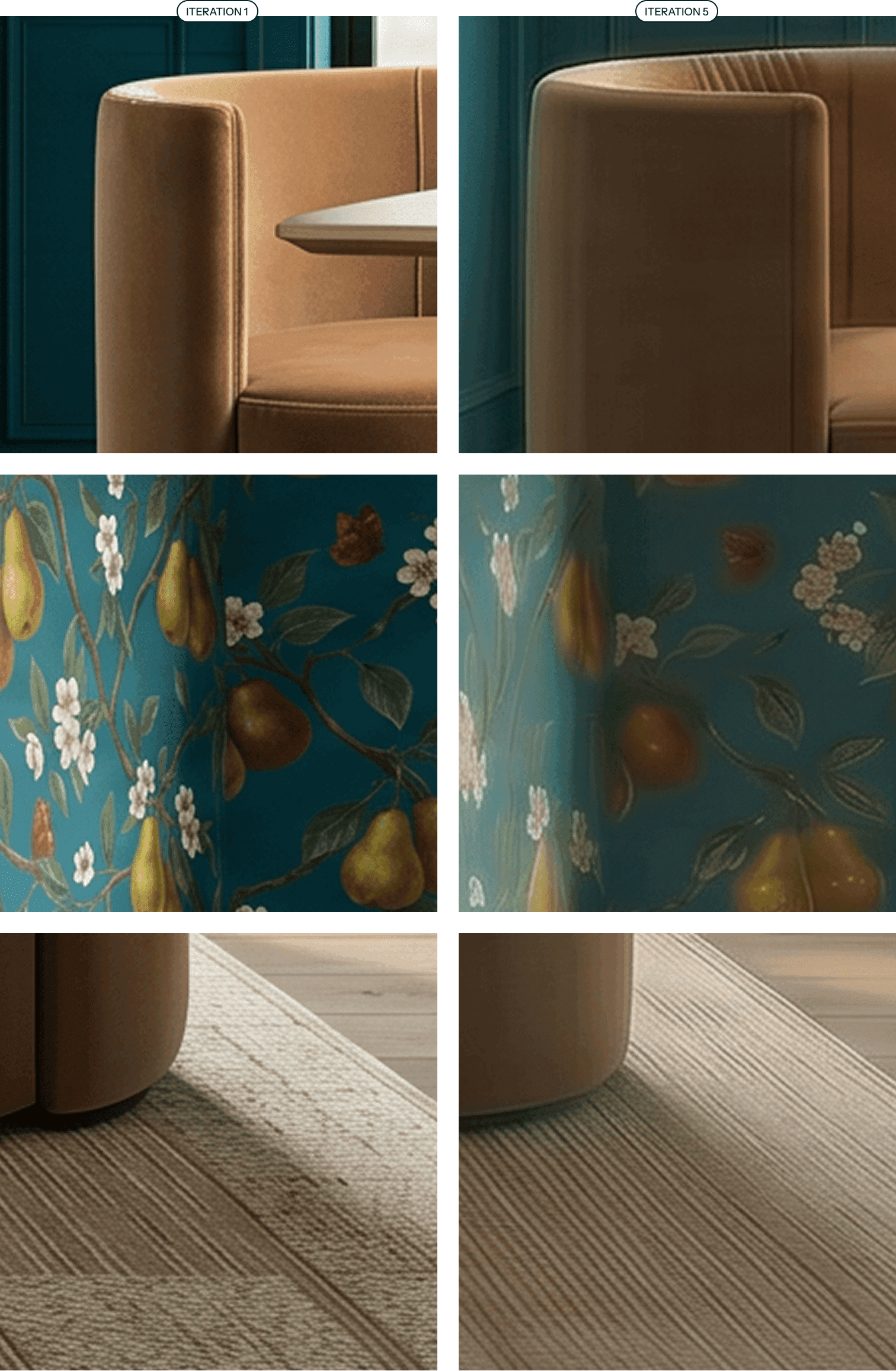
Same three details, iteration 1 (left) vs iteration 5 (right). The velvet, the pear wallpaper, and the rug weave all lose definition as generation loss sets in.
Why does generation loss happen?
When you ask AI to tweak one thing in an existing image, it does not surgically change only that thing. It re-generates the whole image and tries to reconstruct everything else from what it sees. It cannot perfectly rebuild fine detail, so it approximates, and it treats the previous pass's mistakes as if they were intentional. Every round, those approximations stack: high-frequency detail like fabric weave, wallpaper motifs, and thin window grids gets progressively smoothed away, colors creep brighter, and edges thicken or smear.
In short: the AI is redrawing your image from memory every single time, and its memory gets blurrier with each pass.
What generation loss actually looks like: a real walkthrough
Here is a dining room I wanted to render. I had a concept and a specific wallpaper I wanted on the walls.
Inputs

The dining room concept comp (layout, furniture, palette).

The pear-and-blossom wallpaper I wanted on the upper walls.
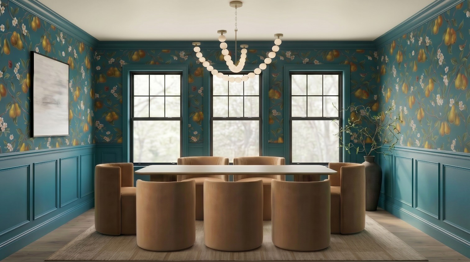
I ran every generation in Nano Banana 2, with the exception of the upscalers, more on them later. My preferred tool these days is Flora AI, but these techniques can be used with any AI image rendering tool. Here is each iteration, exactly as it went.
Iteration 1
Prompt
TASK: Render a photorealistic, Architectural Digest-quality photograph of THIS dining room, using the two attached images as exact references. Do not invent a new room, reproduce the layout, furniture, and palette from the comp, and apply the wall treatment described below.
REFERENCE IMAGES, use each for its specific role. Image A: the EXACT wall covering for the UPPER wall. Painterly chartreuse-and-russet pears, brown branches, green leaves, and small white blossoms on a deep peacock teal-blue ground. Reproduce this print faithfully. Image B: architecture, layout, and all furnishings, the wood dining table, the eight caramel velvet barrel swivel chairs, the beaded orb chandelier, the three black-framed windows, the framed abstract artwork, the black ceramic vase with branches, the woven rug, and the wood plank floor. Match faithfully. IGNORE the plain walls in the comp, replace them with the treatment below.
WALL & MILLWORK TREATMENT (override the comp's blank walls). LOWER wall: paneled wainscoting / millwork up the bottom third of the wall (~32-36 inches), painted a solid deep peacock teal pulled from the wallpaper's background. Shaker-style recessed panels with a slim chair-rail molding and a chunky baseboard, all in the same teal. UPPER wall: the Image A pear wallpaper, from the chair rail up to the ceiling. A clean horizontal chair rail divides the wainscoting from the wallpaper. CROWN MOLDING and window casings in the same teal as the wainscoting. CEILING: soft warm white, to keep the room light.
CAMERA: straight-on, eye-level view of the dining table from the comp's vantage, table centered under the chandelier, the wallpapered focal wall and windows behind, the artwork wall to the right. Natural one-point perspective.
ASSEMBLY & REALISM: One cohesive photograph with real spatial depth, correct relative scale, accurate materials, matte velvet chairs, warm oak table, glass-and-brass chandelier, woven fiber rug, subtly textured wallpaper, painted wood millwork. Soft contact shadows, gentle lived-in imperfection.
LENS: 35mm, natural perspective, medium aperture, crisp focus throughout. LIGHTING: bright early-morning light, clear cool-warm dawn sun streaming in low through the windows, long soft morning shadows, fresh and luminous, no flash. COLOR: clean, true color; keep the teal wallpaper ground and pears true to Image A and the caramel velvet true to the comp. MOOD: fresh, serene, morning-bright. STYLE: high-end editorial interior, photorealistic, shot on medium format digital. ASPECT RATIO: 16:9.
INCLUDE EVERY PIECE, do not omit any: wood dining table, all eight caramel velvet barrel chairs, the beaded orb chandelier, the three black-framed windows, the framed abstract artwork, the black ceramic vase with branches, the woven rug, the wood plank floor. The vase with branches and the rug are easy to miss, they must be present.
Output

Good quality, but the positioning in the room is wrong, and I know I need an extra chair. The vase is not placed correctly. Neither is the chandelier.
Iteration 2
Prompt
The table should be running parallel to the back, windowed wall. Chairs should be neatly tucked in. Vase with stems should be 2x the size and positioned in the back right corner of the room.
Output

Positioning is slightly better. The vase is still totally wrong.
Iteration 3
This time I added the vase image itself as an input.

Prompt
Replace the vase with [vase.png]. Place the vase in the far right corner of the room.
Output

The vase is right now, but it is not positioned correctly.
Iteration 4
Prompt
Move the vase that's currently in the front right corner of the room to the back right corner of the room.
Output
Better! But shoot, I forgot about the chairs.
Iteration 5
Prompt
The table should have 3 chairs along each LONG edge and 1 chair on each short edge.
Output
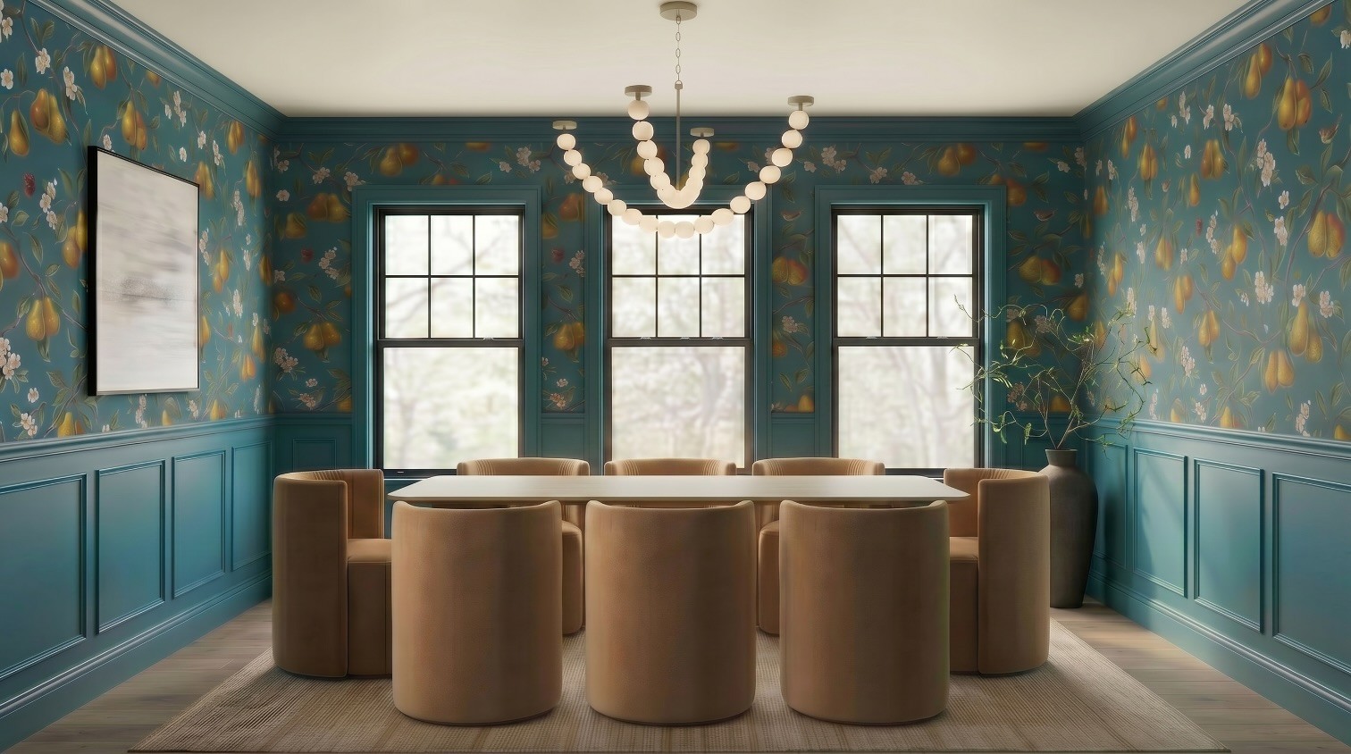
At this point everything is spatially almost there (minus the chandelier), but the image has clearly degraded. This is generation loss. Look at the wallpaper, the velvet, and the rug compared to iteration 1: the detail is gone soft, edges are smearing, and it reads fuzzy. Five rounds of editing got me the right layout and a picture I would not show a client.
How to fix generation loss
There are two main ways to recover. The first patches a degraded image. The second restarts smarter and gets you a genuinely better result. I will show both on this exact room.
Method 1: Upscalers
An upscaler rebuilds resolution and detail into an image. Run on a degraded render, it helps to a point, but it is not a silver bullet. It works best for images that will be viewed small, where missing texture and slightly off detail are harder to notice, or for renders that are only 2 to 3 iterations deep, before the degradation gets severe.
A key thing to understand: upscalers are not all the same. Some are built to restore (recover real detail faithfully), and some are built to reimagine (invent plausible detail). Topaz leans restoration. Magnific leans creative reinvention. That difference matters a lot when accuracy to a real product is the whole point of your render.
I tested both on the iteration 5 output.
Upscaler input
Magnific Creative Upscaler (Test 1)
Settings: Resemblance 35, Detail 80, Optimization 3D Renders, Engine Sharpy, Scale 2X, Fractality 55, Creativity 35.
Prompt:
Interior dining room, crisp velvet upholstery weave, woven flatweave rug, matte ceramic vase, detailed botanical wallpaper, natural window light

Magnific Creative Upscaler (Test 2)
Settings: Resemblance 40, Detail 90, Optimization 3D Renders, Engine Sharpy, Scale 2X, Fractality 80, Creativity 45.
Prompt:
Interior dining room, crisp velvet upholstery weave, woven flatweave rug, matte ceramic vase, detailed botanical wallpaper, natural window light

Topaz Upscaler
Settings: Scale 2, Enhancement CGI. No prompt entered.

The upscalers helped somewhat, but you can see where some detail simply could not be recovered, and the upscaling introduced strange artifacts of its own. You cannot restore information that the generation loss already destroyed. You can only approximate it.

Iteration 5 versus the upscaler outputs. Better, but the wallpaper detail, velvet texture, and rug weave never fully come back.
Method 2: Reprompting
This is the better fix. Instead of trying to rescue the degraded image, use it to write a fresh, much smarter prompt, then start a brand new generation. This time you already know which parts the AI struggled with, so you give it references for exactly those things up front.
All references this time
| |  |
|  |  |
I had Claude (Opus 4.8) write the new generation prompt for me, feeding it the degraded result plus all the references.
Prompt to Claude
Write a prompt for Nano Banana 2 that will get me this exact image. Please reference [wallpaper.png], [chair.png], [artwork.png], [rug.png], [vase.png], and [dining room.png].
Claude's output (the new generation prompt)
A photorealistic interior design photograph of an elegant formal dining room, eye-level frontal symmetrical composition, natural daylight streaming through windows.
Walls: upper portion covered in the lush teal pear-and-blossom botanical wallpaper from reference [wallpaper.png], featuring golden-green pears, white apple blossoms, trailing brown branches, small birds and butterflies on a deep teal-blue background. Lower portion finished with matching teal-blue painted wainscoting and recessed panel molding, crisp crown molding at the ceiling.
Windows: three tall black-framed double-hung grid windows centered on the back wall, overlooking a soft blurred green springtime treeline outside.
Lighting: a sculptural beaded orb chandelier with frosted glass spheres in a swooping U-shaped strand, brushed brass ceiling mounts, hung centrally over the table (as in reference [dining room.png]).
Table: a long oval-edged dining table with a light warm-wood top and sculptural curved wooden pedestal legs.
Seating: eight rounded barrel-back swivel chairs upholstered in warm camel-tan velvet with subtle vertical channel stitching on the backrest, matching the chair in reference [chair.png], arranged snugly around the table.
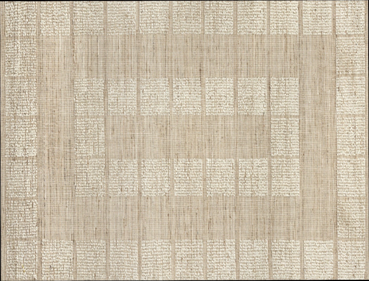
Floor: light oak wood plank flooring topped with a large textured natural beige-jute area rug featuring a subtle tonal block weave pattern, matching reference [rug.png].
Left wall: a large framed abstract painting in soft gray, white and taupe brushstrokes with a thin dark frame, matching reference [artwork.png]. Right corner: a tall matte black ceramic vase holding airy curling green-leaf branches, matching reference [vase.png].
Style: high-end interior magazine photography, warm and inviting, balanced symmetry, soft realistic shadows, refined transitional decor, 8k, sharp focus, natural color grading.
Negative prompt: distorted furniture, extra chandeliers, cluttered decor, harsh artificial lighting, text, watermark, warped windows, blurry details.
Reprompt, attempt 1
Using that prompt, here is the very first output.
Way closer than my original iteration 1, on the first try, and at full clarity. But still not perfect, so let's refine.
Reprompt, attempt 2
Instead of iterating on attempt 1 (which would start the generation loss clock all over again), I reprompted again, adjusting the prompt based on what I now knew the AI needed more help with. The changes: crown molding set to match the wainscoting color, the chandelier attachment points called out as obviously anchored to the ceiling, and an explicit chair count of three on each long edge and one on each short end.
Output

So much better. Just a couple of small adjustments left on the chairs so they are scaled and positioned a little better.
One clean iteration on reprompt 2
Now, and only now, I iterate once, on a high-quality starting image, so a single edit will not visibly degrade it.
Prompt (using reprompt 2's output as the input):
Tuck the chairs in more, make them 20% larger, change nothing else.

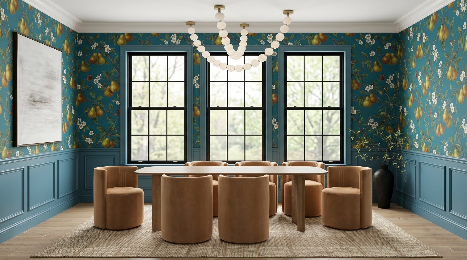
This looks dramatically better than the version I iterated on five times, and it is still crisp. Same room, same design intent, a fraction of the degradation.

Left, five rounds of editing (generation loss). Right, reprompt plus one clean iteration. Same intent, very different quality.
Method 3: Upscale your reprompted image for final polish
Upscaling was underwhelming on a degraded image. On a clean one, it is the opposite: when you start with a strong image, an upscaler adds a final layer of polish instead of fighting artifacts.
Magnific Creative Upscaler. Settings: Resemblance 55, Detail 80, Optimization 3D Renders, Engine Sharpy, Scale 2X, Fractality 55, Creativity 35.

Topaz Upscaler. Settings: Scale 2, Enhancement CGI.

Comparing all the outputs side by side, the winning workflow is clear: reprompt to a clean image first, then upscale.

The full comparison, degraded iteration vs reprompt vs reprompt plus upscale.
Reprompt or keep editing? A simple rule
Edit (iterate) when you are making a small number of changes to an already-good image and you can stop after one or two passes. Each edit is a withdrawal from your quality account, so spend sparingly.
Reprompt when you have made three or more edits, the image is starting to soften, or you keep fighting the same element. Use the degraded image as a learning tool, write a sharper prompt with references for the tricky parts, and start fresh.
Upscale last, on your best clean image, for final polish before a client sees it. Do not lean on it to rescue a render that has already degraded.
The mindset shift that saves the most time: a degraded render is not a failure, it is a really detailed brief for your next prompt. You now know exactly what the AI gets wrong about your design, so you can tell it up front.
FAQ
What is generation loss in AI images?
Generation loss is the cumulative quality drop that happens when you repeatedly edit and re-generate an AI image using each output as the next input. Detail blurs, edges smear, and colors shift, like a photocopy of a photocopy. It is also called iterative degradation or drift.
Why does my AI render get blurry or warped every time I edit it?
Because the AI does not edit your image in place. It re-generates the entire image each time and reconstructs everything from what it sees, treating the last pass's errors as intentional. Fine detail like fabric weave, wallpaper, and thin window grids cannot be perfectly rebuilt, so it degrades a little more every round.
How many edits before an AI image starts degrading?
In practice, it often shows around the third or fourth edit, and it is usually obvious by the fifth. It depends on the model and how large each change is, but if you are past three edits and chasing the same fix, assume degradation is setting in.
Can an upscaler fix a blurry AI render?
Partially. Upscalers help most when an image will be viewed small, and they work far better on a clean image than a degraded one. They cannot restore detail that generation loss already destroyed, and aggressive settings can add their own artifacts.
Is it better to reprompt or to keep editing?
Reprompt once you have made several edits or the image is softening. Starting a fresh generation with a smarter, reference-backed prompt consistently beats editing a degrading image, and it gets you a higher-quality result faster.
Should I use Magnific or Topaz to upscale an interior render?
Topaz leans toward faithful restoration, which is safer when the render must match real products exactly. Magnific leans toward creative reinvention, which adds richer texture but can invent detail. For client-facing accuracy, restoration-first is usually the safer default; use creative upscaling when a little invented texture helps more than it hurts.
What tools were used in this walkthrough?
The renders were generated with Nano Banana 2 (run in Flora AI). The new generation prompt was written with Claude (Opus 4.8). Upscaling was tested in Magnific and Topaz.
Glintera helps interior designers get aligned with clients before the work starts. If you found this useful, join the newsletter for more practical AI workflows built for interior designers, or get on the Glintera waitlist.
{"@context":"https://schema.org","@type":"FAQPage","mainEntity":[{"@type":"Question","name":"What is generation loss in AI images?","acceptedAnswer":{"@type":"Answer","text":"Generation loss is the cumulative quality drop that happens when you repeatedly edit and re-generate an AI image using each output as the next input. Detail blurs, edges smear, and colors shift, like a photocopy of a photocopy. It is also called iterative degradation or drift."}},{"@type":"Question","name":"Why does my AI render get blurry or warped every time I edit it?","acceptedAnswer":{"@type":"Answer","text":"Because the AI does not edit your image in place. It re-generates the entire image each time and reconstructs everything from what it sees, treating the last pass's errors as intentional. Fine detail like fabric weave, wallpaper, and thin window grids cannot be perfectly rebuilt, so it degrades a little more every round."}},{"@type":"Question","name":"How many edits before an AI image starts degrading?","acceptedAnswer":{"@type":"Answer","text":"In practice, it often shows around the third or fourth edit, and it is usually obvious by the fifth. It depends on the model and how large each change is, but if you are past three edits and chasing the same fix, assume degradation is setting in."}},{"@type":"Question","name":"Can an upscaler fix a blurry AI render?","acceptedAnswer":{"@type":"Answer","text":"Partially. Upscalers help most when an image will be viewed small, and they work far better on a clean image than a degraded one. They cannot restore detail that generation loss already destroyed, and aggressive settings can add their own artifacts."}},{"@type":"Question","name":"Is it better to reprompt or to keep editing?","acceptedAnswer":{"@type":"Answer","text":"Reprompt once you have made several edits or the image is softening. Starting a fresh generation with a smarter, reference-backed prompt consistently beats editing a degrading image, and it gets you a higher-quality result faster."}},{"@type":"Question","name":"Should I use Magnific or Topaz to upscale an interior render?","acceptedAnswer":{"@type":"Answer","text":"Topaz leans toward faithful restoration, which is safer when the render must match real products exactly. Magnific leans toward creative reinvention, which adds richer texture but can invent detail. For client-facing accuracy, restoration-first is usually the safer default; use creative upscaling when a little invented texture helps more than it hurts."}},{"@type":"Question","name":"What tools were used in this walkthrough?","acceptedAnswer":{"@type":"Answer","text":"The renders were generated with Nano Banana 2 (run in Flora AI). The new generation prompt was written with Claude (Opus 4.8). Upscaling was tested in Magnific and Topaz."}}]}
