
Best Dark Blue Kitchen Cabinet Paint Colors, Compared (Same Kitchen, 6 Ways)
The same kitchen, six dark blues, one comparison. See how Naval, Hale Navy, Hague Blue and others read in real light, with exact codes.


The best dark blue for kitchen cabinets depends on undertone and light, which is why the same six navies can look completely different in one kitchen. Naval (Sherwin-Williams) reads nearly black, Hale Navy (Benjamin Moore) is the safe classic, Hague Blue and Stiffkey Blue (Farrow & Ball) lean moody and dusty, and Van Deusen Blue and Newburyport Blue (Benjamin Moore) sit in between. Below is the same kitchen rendered in all six, with exact codes, so you can see how each one actually reads before you commit.


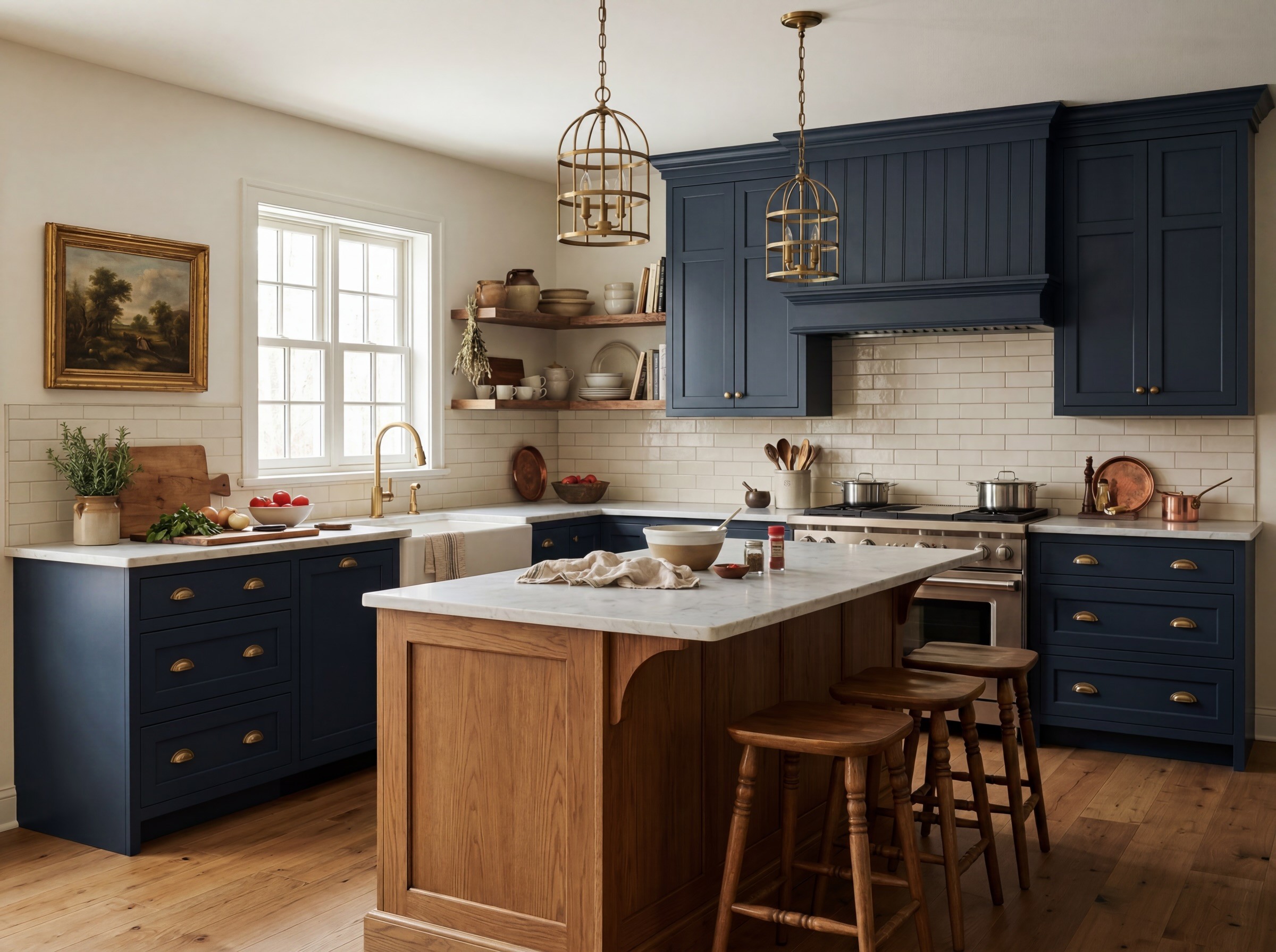
A chip on a fan deck never reads the same as a full room. A deep blue that looks perfect on a sample can go cold, flat, or near-black once it is on every cabinet door in real light. So we put one kitchen, same angle, same light, in six of the most-loved designer navies. Here is how they compare.
The six blues, side by side
Color | Brand & code | Hex | How it reads |
|---|---|---|---|
Van Deusen Blue | Benjamin Moore HC-156 | #485B6E | A balanced blue-grey, not too dark |
Stiffkey Blue | Farrow & Ball No. 281 | #4A5B6B | Softens to a dusty, slightly muted blue |
Newburyport Blue | Benjamin Moore HC-155 | #465566 | Classic mid-deep navy |
Hague Blue | Farrow & Ball No. 30 | #3F4D57 | Moody and atmospheric, leans teal-ink |
Hale Navy | Benjamin Moore HC-154 | #434B56 | The safe, timeless classic |
Naval | Sherwin-Williams SW 6244 | #2F3D4C | Reads nearly black at full scale |
Why the same blue looks so different
Two forces change how each color reads once it is on the cabinets.
Undertone. These are not flat blues. Each carries a lean, toward grey, green, or black, that only shows up at full scale. Stiffkey and Hague Blue can look nearly identical on a chip and then swing cool versus warm the second real light hits them. Naval's depth tips it almost to black across a whole run of cabinetry.
Light. North light cools a color and can flatten a navy toward grey. Warm afternoon light pulls the same color toward its richer, moodier self. The amount of natural light in the kitchen will change which of these six feels right, which is exactly why seeing them in the actual space matters more than the chip.
How to choose the right navy
A few ways to narrow it down:
Match the undertone to the room. Warm woods and brass pair beautifully with the moodier, slightly warm blues like Hague. Cooler marbles and chrome can take a cleaner navy like Newburyport or Hale Navy.
Account for your light. Low-light kitchens get darker and flatter, so a near-black like Naval can become a cave; a mid-navy may read better. Bright kitchens can carry the deepest options.
Trust the gut reaction, then verify. When a client lights up at one of these, that is signal. Confirm it by seeing it at full scale in the room, not just on the sample.
Need it in a different brand?
Found a blue you love but need it in another brand's line for the cabinetry product you are using? Glintera's free paint color tool finds the closest match across Benjamin Moore, Sherwin-Williams, and Farrow & Ball, and gives you the hex and RGB to drop into your deck or render.
→ Open the free paint color tool
FAQ
What is the best dark blue for kitchen cabinets?
It depends on your light and the undertones in the room, but the most reliable designer favorites are Hale Navy (Benjamin Moore) for a timeless classic, Naval (Sherwin-Williams) for a dramatic near-black, and Hague Blue (Farrow & Ball) for a moody, atmospheric look. Seeing each at full scale in your actual kitchen light is the only way to be sure.
What's the difference between Hale Navy and Naval?
Hale Navy (Benjamin Moore HC-154, #434B56) is a balanced, classic navy that stays readable as blue. Naval (Sherwin-Williams SW 6244, #2F3D4C) is deeper and reads nearly black across a full run of cabinetry. In a low-light kitchen, Naval can feel almost black, while Hale Navy holds more of its blue.
Why does my navy cabinet color look different than the sample?
Because a small chip and a full room are different. Undertones, toward grey, green, or black, only show at full scale, and the light in the room shifts the color cool or warm. A navy that looks perfect on a chip can read flat or near-black once it covers every door, which is why testing in the actual space matters.
How do undertones affect dark blue paint colors?
Each navy leans a certain way beneath the surface. Two blues that look identical on a fan deck, like Stiffkey and Hague, can swing cool versus warm the moment real light hits them. The undertone determines which woods, metals, and stones the color pairs with, so it matters more than the name.
Can I match a navy cabinet color across paint brands?
Yes. If you love a blue in one brand but need it in another for a specific cabinet product, a paint color tool finds the closest equivalent and gives you the hex and RGB for both. That keeps the look consistent when you switch product lines.
{"@context":"https://schema.org","@type":"FAQPage","mainEntity":[{"@type":"Question","name":"What is the best dark blue for kitchen cabinets?","acceptedAnswer":{"@type":"Answer","text":"It depends on your light and the undertones in the room, but the most reliable designer favorites are Hale Navy (Benjamin Moore) for a timeless classic, Naval (Sherwin-Williams) for a dramatic near-black, and Hague Blue (Farrow & Ball) for a moody, atmospheric look. Seeing each at full scale in your actual kitchen light is the only way to be sure."}},{"@type":"Question","name":"What's the difference between Hale Navy and Naval?","acceptedAnswer":{"@type":"Answer","text":"Hale Navy (Benjamin Moore HC-154, #434B56) is a balanced, classic navy that stays readable as blue. Naval (Sherwin-Williams SW 6244, #2F3D4C) is deeper and reads nearly black across a full run of cabinetry. In a low-light kitchen, Naval can feel almost black, while Hale Navy holds more of its blue."}},{"@type":"Question","name":"Why does my navy cabinet color look different than the sample?","acceptedAnswer":{"@type":"Answer","text":"Because a small chip and a full room are different. Undertones, toward grey, green, or black, only show at full scale, and the light in the room shifts the color cool or warm. A navy that looks perfect on a chip can read flat or near-black once it covers every door, which is why testing in the actual space matters."}},{"@type":"Question","name":"How do undertones affect dark blue paint colors?","acceptedAnswer":{"@type":"Answer","text":"Each navy leans a certain way beneath the surface. Two blues that look identical on a fan deck, like Stiffkey and Hague, can swing cool versus warm the moment real light hits them. The undertone determines which woods, metals, and stones the color pairs with, so it matters more than the name."}},{"@type":"Question","name":"Can I match a navy cabinet color across paint brands?","acceptedAnswer":{"@type":"Answer","text":"Yes. If you love a blue in one brand but need it in another for a specific cabinet product, a paint color tool finds the closest equivalent and gives you the hex and RGB for both. That keeps the look consistent when you switch product lines."}}]}
