
Dining Room Wallpaper and the Paint Colors That Finish It
The dining room is where you can go bold. Seven wallpapers, from deep navy to soft sage, each with the paint colors that finish it, pulled from the ground.

This post contains affiliate links. If you buy through them, we may earn a small commission at no extra cost to you. We only feature products we'd specify ourselves.
The dining room is the one room where you can go bold, and the paint that finishes a wallpaper almost never comes from the loudest part of the pattern. It comes from the ground behind it. Pull the background color onto your walls, trim, or wainscoting and the room reads collected instead of busy. Below are seven wallpapers, grouped from dramatic to soft, with the exact designer paint that finishes each one.
A dining room isn’t a room you live in all day. You use it at night, for gatherings, under candlelight. That’s why it’s the room designers reach for when they want to take a risk with wallpaper. The pattern can be as bold as you want, as long as the paint around it agrees.
The move is always the same: pull your paint from the wallpaper’s ground (the field the pattern sits on), not the loud motif. Match the background and the whole room settles. Below, the seven patterns and the color that finishes each.
All wallpapers are from Wallshoppe. Paint hex values are approximate screen renderings, so confirm on a fan deck before you commit, especially the greens and teals, which are the hardest colors to read off a screen.
Go bold: the dramatic dining rooms
Townhouse, Pearl on Deep Navy (Sarah Jessica Parker)
Pearl-white botanical line drawings float on a deep ink ground that reads more dark teal than true navy. Pull the ground onto your wainscoting or trim and the pearl florals glow against it.
Pull the ground: Sherwin-Williams Rookwood Shutter Green (SW 2809) on the wainscoting or trim.
The rest of the palette: Farrow & Ball Calamine for the pearl florals, and Sherwin-Williams Woven Wicker (SW 9104), a warm neutral that picks up the lighter linework.
Shop the wallpaper: Townhouse by Wallshoppe
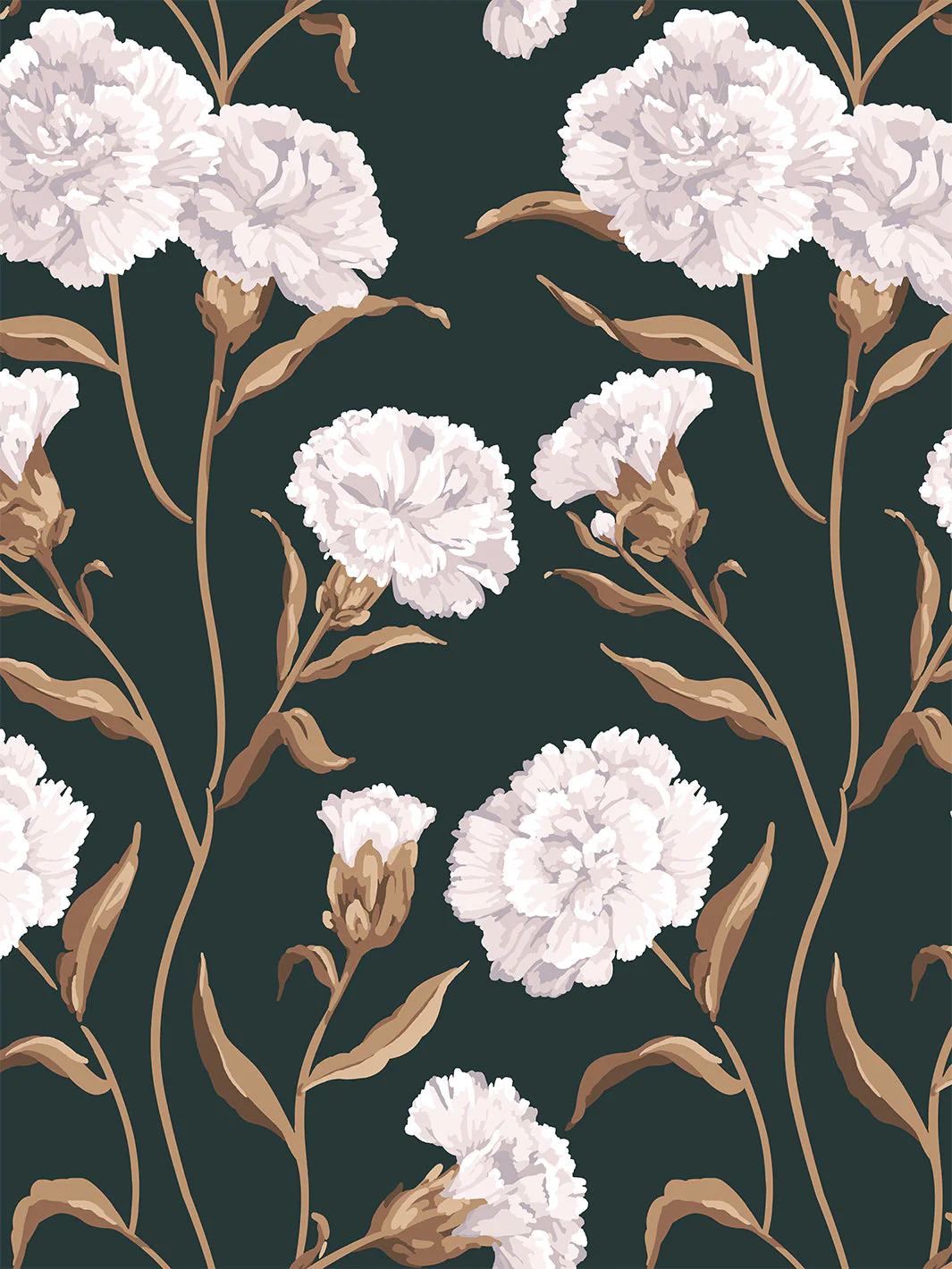
Barbara Ann, Aubergine

A dense botanical floral that reads as a blackened plum, the pattern barely darker than the ground it sits on. Wrap the room in the aubergine and let the florals do the work.
Pull the ground: Farrow & Ball Pelt on the walls or wainscoting.
The rest of the palette: Benjamin Moore Black (PM-9) for the deepest accent, a trim line or a single piece of furniture.
Shop the wallpaper: Barbara Ann by Wallshoppe
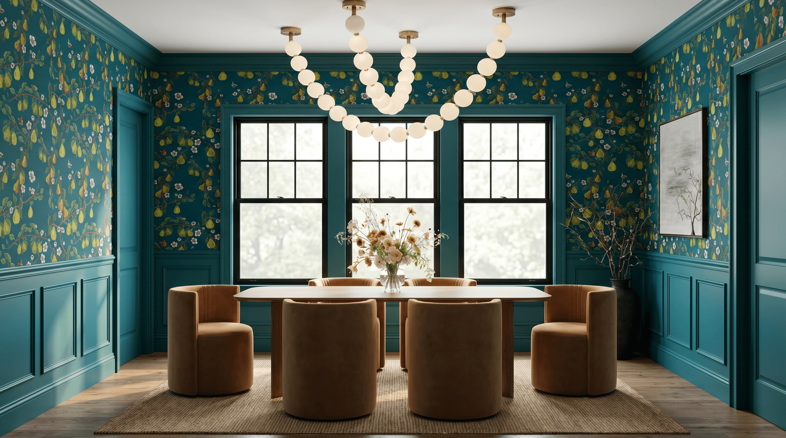
Giardino di Pere, Peacock
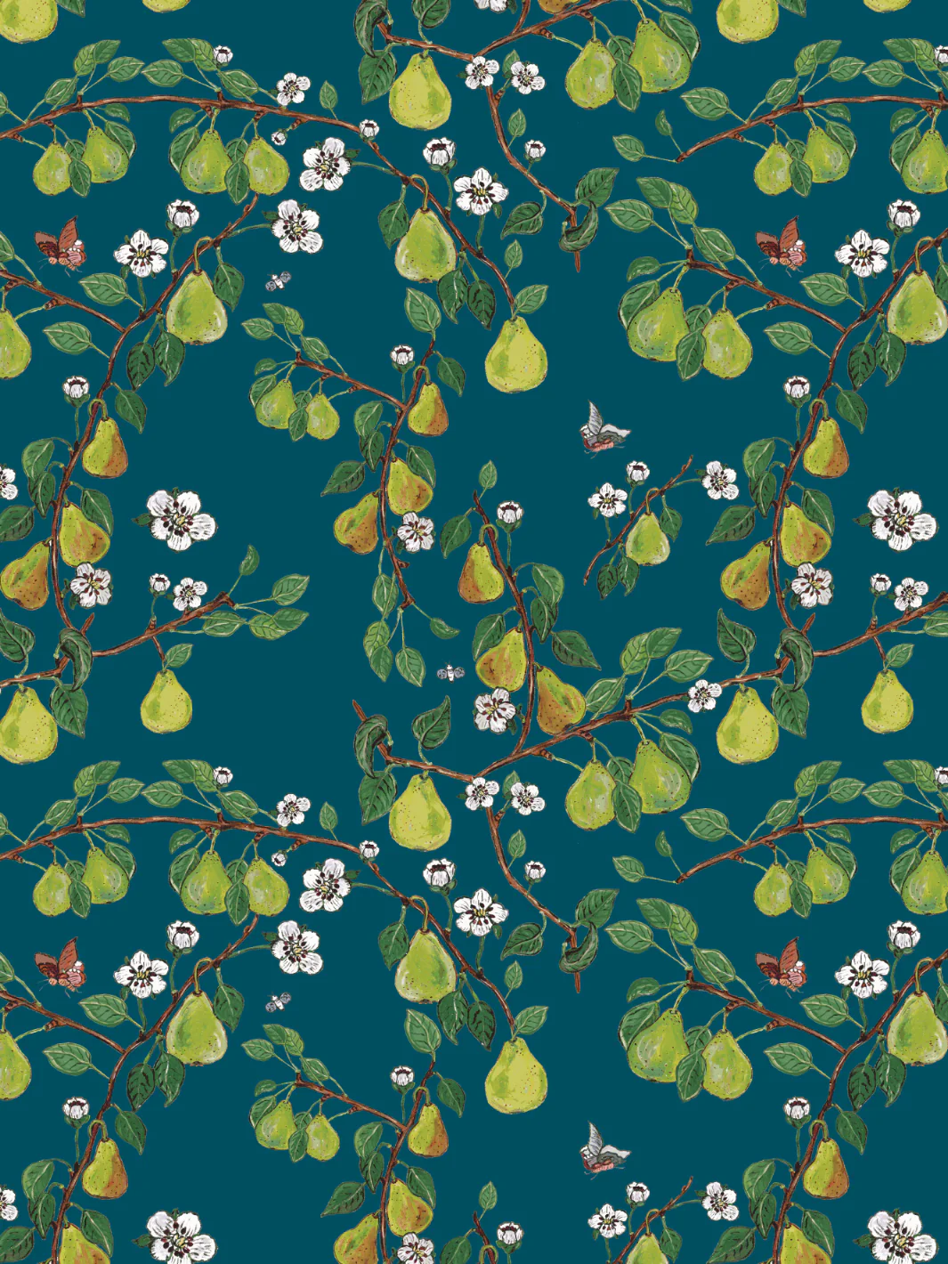
Pears, foliage, and birds on a rich peacock teal. The ground is the whole mood, so match it and let the pattern’s brighter notes stay in the paper.
Pull the ground: Sherwin-Williams Oceanside (SW 6496), a true peacock teal, on the walls.
The rest of the palette: Farrow & Ball Acid Drop for the chartreuse foliage, Benjamin Moore Cornwallis Red (CW-315) for the bird, Farrow & Ball All White for the highlights, and Sherwin-Williams Polished Mahogany (SW 2838) in the deepest branches.
Shop the wallpaper: Giardino di Pere by Wallshoppe
Keep it light: the soft and fresh dining rooms
Queen Anne’s Lace, Pepper (Sarah Jessica Parker)
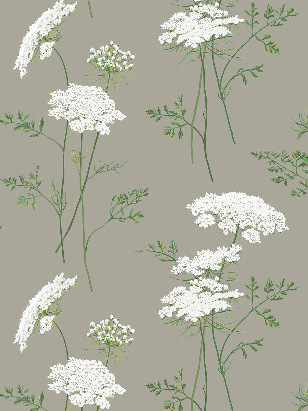
White lace florals and butterflies on a soft sage-greige. The most serene of the set, and an easy yes for a calm, sunlit dining room.
Pull the ground: Sherwin-Williams Dorian Gray (SW 7017) on walls and trim, so the white lace lifts off it.
The rest of the palette: Sherwin-Williams Pure White (SW 7005) for the lace, with Sherwin-Williams Dill (SW 6438) and Benjamin Moore Martha’s Vineyard (630) for the greens.
Shop the wallpaper: Queen Anne’s Lace by Wallshoppe
Lily Pad Lake, Oyster

Swans and lily pads on a pale oyster-blush. Soft and a little romantic without going sweet.
Pull the ground: Benjamin Moore Rosemist (1366) on walls and trim.
The rest of the palette: the lily-pad greens, from Benjamin Moore Balsam (567) through Chrome Green (HC-189) to the deepest Black Forest Green (HC-187), plus Farrow & Ball All White for the highlights.
Shop the wallpaper: Lily Pad Lake by Wallshoppe
Orange Crush, Sky
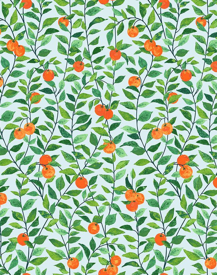
Green vines and bright orange poppies on a pale sky-blue. This is the “let the paper be loud” case. The paint’s whole job is to disappear so the poppies sing.
Pull the ground: Benjamin Moore Icing on the Cake (2049-70), a pale sky, on walls and trim so the print pops.
The rest of the palette: the vine greens, Benjamin Moore Vine Green (2034-20), Rainforest Foliage (2040-10), and Lime Tart (2033-40), plus Rumba Orange (2014-20), the poppy. Keep Rumba Orange to a tiny accent only. Painting a wall the bloom color would tip the room into costume.
Shop the wallpaper: Orange Crush by Wallshoppe
Majesty Palm, Chocolate Grasscloth
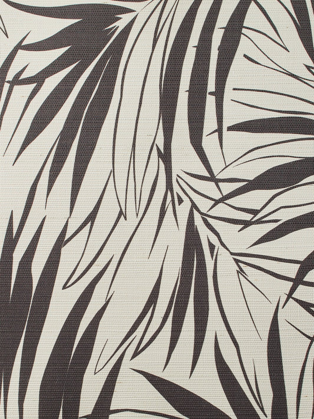
Chocolate palm silhouettes on natural woven grasscloth. Tonal, textural, and quietly dramatic.
Pull the ground: Farrow & Ball Cornforth White on walls and trim, matching the woven grasscloth.
The rest of the palette: Sherwin-Williams Urbane Bronze (SW 7048) to echo the chocolate fronds, on a built-in or the trim.
Shop the wallpaper: Majesty Palm by Wallshoppe
All seven at a glance
Wallpaper | Vibe | Pull the ground with |
|---|---|---|
Townhouse (Pearl on Deep Navy) | Dramatic | SW Rookwood Shutter Green (SW 2809) |
Barbara Ann (Aubergine) | Dramatic | F&B Pelt |
Giardino di Pere (Peacock) | Dramatic | SW Oceanside (SW 6496) |
Queen Anne’s Lace (Pepper) | Soft | SW Dorian Gray (SW 7017) |
Lily Pad Lake (Oyster) | Soft | BM Rosemist (1366) |
Orange Crush (Sky) | Bright | BM Icing on the Cake (2049-70) |
Majesty Palm (Chocolate Grasscloth) | Tonal | F&B Cornforth White |
How to use the paint in a dining room
Three reliable moves, depending on how far you want to go:
Full drench (most dramatic): walls, trim, and ceiling all in the ground color. Best with the dark patterns (Townhouse, Barbara Ann).
Wainscoting or chair rail: wallpaper above, the ground color painted below. Works for almost any of these.
Trim and built-ins only: wallpaper on the walls, the pulled color on the millwork to tie it together. Best for the lighter patterns.
Need it in a different brand?
Found the right color but need it in another brand’s line for the trim product or finish you’re using? Glintera’s free paint color tool finds the closest match across Benjamin Moore, Sherwin-Williams, and Farrow & Ball, and gives you the hex and RGB to drop into your deck or render.
→ Open the free paint color tool
FAQ
What color should I paint a room with wallpaper in it?
Pull the color from the wallpaper’s background, not its boldest motif. The ground is the largest area of the pattern, so matching it on your walls, trim, or wainscoting makes the wallpaper feel built-in instead of pasted on. Painting the wall the loudest color in the pattern makes the room compete with itself.
What wallpaper is best for a dining room?
Dining rooms are used mostly at night and for gatherings, not all day, which makes them the room where designers most often go bold. Dramatic, saturated patterns (deep navy, aubergine, near-black botanicals) read beautifully under candlelight, while softer sage or blush patterns suit a brighter, calmer dining room. Either works as long as the paint is pulled from the wallpaper’s ground.
Should the trim match the wallpaper?
Painting the trim a color pulled from the wallpaper’s ground is one of the most reliable ways to make a papered room feel finished. It ties the millwork to the paper instead of leaving a white frame that fights it. For the most dramatic effect, carry that same color onto the ceiling for a full “drenched” look.
How do I match paint to a specific wallpaper color?
Identify the wallpaper’s ground color, then find the closest paint across brands and confirm it on a physical fan deck in the room’s actual light. Greens and teals are the hardest to read off a screen, so always verify those in person. A paint-matching tool can give you the closest hex and RGB across Benjamin Moore, Sherwin-Williams, and Farrow & Ball as a starting point.
{"@context":"https://schema.org","@type":"FAQPage","mainEntity":[{"@type":"Question","name":"What color should I paint a room with wallpaper in it?","acceptedAnswer":{"@type":"Answer","text":"Pull the color from the wallpaper's background, not its boldest motif. The ground is the largest area of the pattern, so matching it on walls, trim, or wainscoting makes the wallpaper feel built-in instead of pasted on. Painting the wall the loudest color makes the room compete with itself."}},{"@type":"Question","name":"What wallpaper is best for a dining room?","acceptedAnswer":{"@type":"Answer","text":"Dining rooms are used mostly at night and for gatherings, which makes them the room where designers most often go bold. Dramatic, saturated patterns read beautifully under candlelight, while softer sage or blush patterns suit a brighter, calmer dining room. Either works as long as the paint is pulled from the wallpaper's ground."}},{"@type":"Question","name":"Should the trim match the wallpaper?","acceptedAnswer":{"@type":"Answer","text":"Painting the trim a color pulled from the wallpaper's ground is one of the most reliable ways to make a papered room feel finished. It ties the millwork to the paper instead of leaving a white frame that fights it. For the most dramatic effect, carry that color onto the ceiling for a drenched look."}},{"@type":"Question","name":"How do I match paint to a specific wallpaper color?","acceptedAnswer":{"@type":"Answer","text":"Identify the wallpaper's ground color, then find the closest paint across brands and confirm it on a physical fan deck in the room's actual light. Greens and teals are the hardest to read off a screen, so verify those in person. A paint-matching tool gives you the closest hex and RGB across Benjamin Moore, Sherwin-Williams, and Farrow & Ball."}}]}
